Excel project: Cleaning data for visualization
Part 1:
Highlight: empty rows, duplicates, spelling mistakes, Double whitespaces/missing spaces, Split department name
Row data:
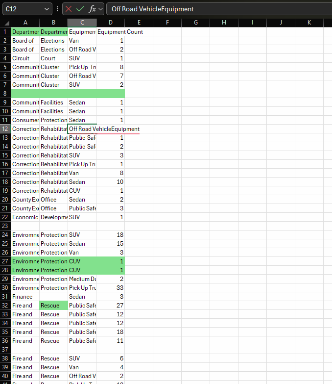
- Removed all empty rows from data
I used Filter to select all blacks then delete them
- Removed duplicates
I used Conditional Formatting to highlight duplicates then delete them
- Correct spelling
I used Spelling from Review tab to replace all spelling mistakes
- Double whitespaces
I used Find and Replace to replace double whitespace with a single one instead.
- Department names in one column
I used Flash fill from home/fill to concatenate both names in one column.
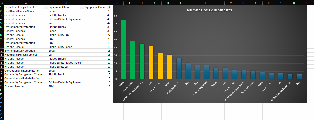
- Visual
I sort Equipment numbers from highest to smaller and show only the first 20 results to highlight in a bar chart
Result:
Part 2: Create a PivotTable to analyze data
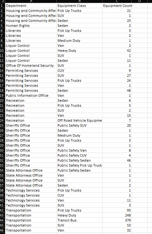
ROW DATA:
STEPS:
CTRL+SHIFT+ARROW DOWN to select the data faster
CTRL+T to create the table(with header)
Calculate Sum, Avg, min, max, count with AutoSum (or functions)
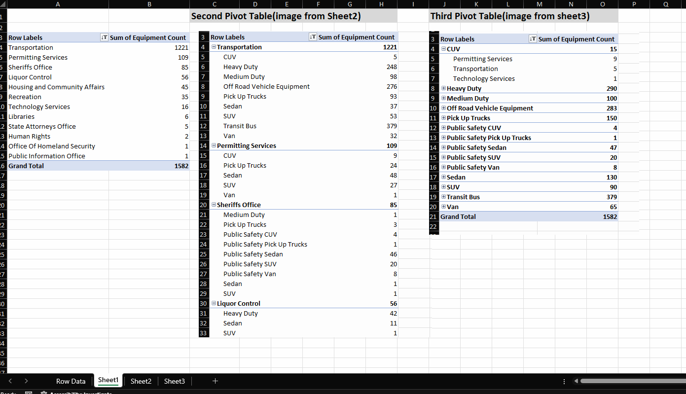
Create a PivotTable, sort by Row Labels to remove aggregated values
Sorting by “Sum of Equipment count” descending.
Create 2 more PivotTables
In the second PivotTable, add the Equipment class in rows(below the department)
In the third PivotTable, add the Equipment class in rows(above the department)
Result:
- Count by Sum of Equipment
- Sort by Department and further by Equipment Class
- Sort by Equipment class and further by Departments
Part 3: Pivot Tables
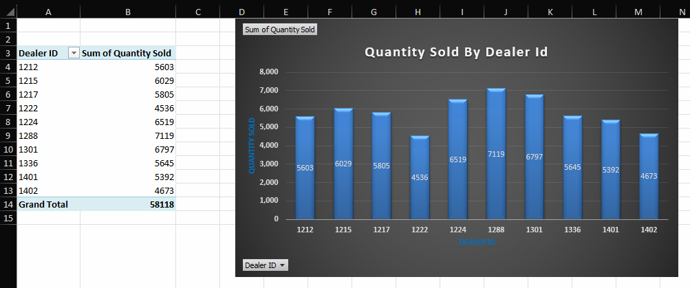
Quantity Sold by Dealer ID
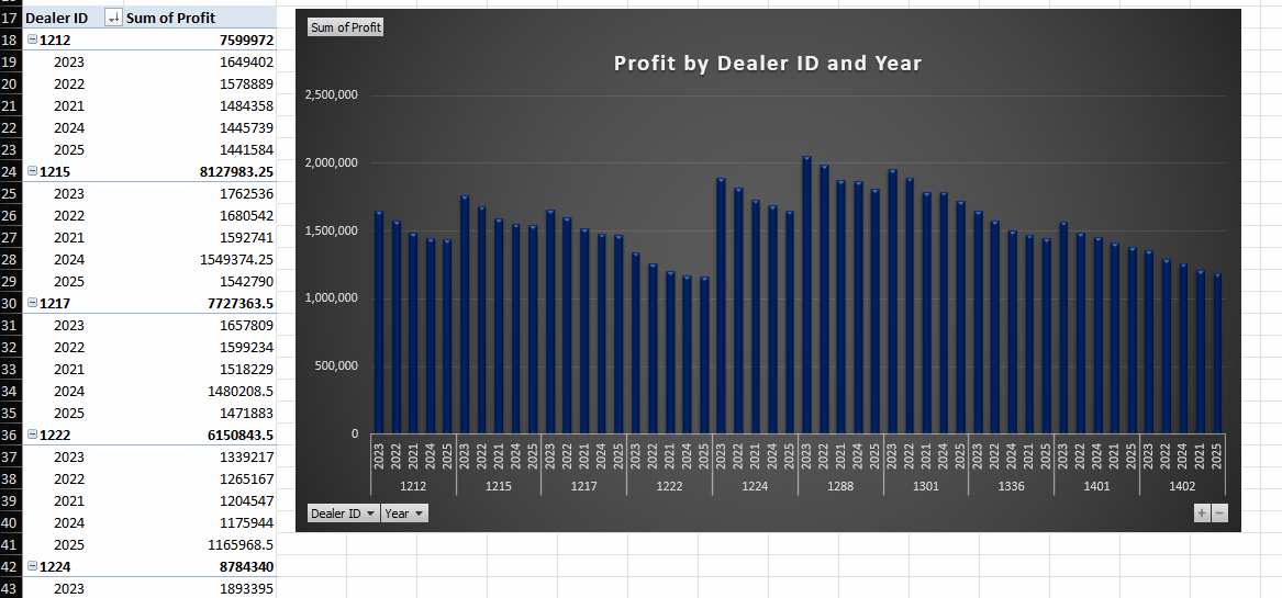
Profit by Dealer ID and Year
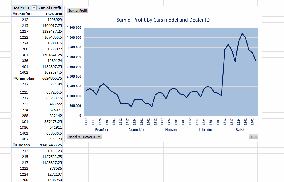
Sum of Profits for Hudson model cars by Dealer ID
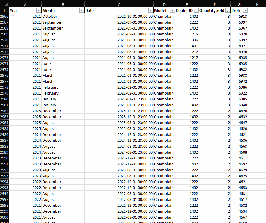
Row data:
Result: